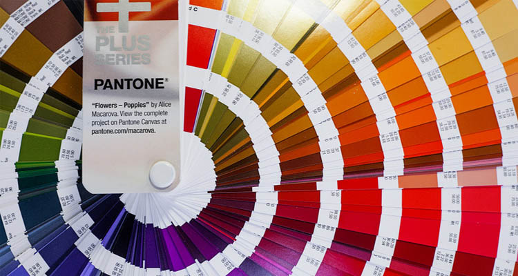
The Pantone factory has been hard at work crafting a new color guide for designers and print professionals. If you don’t know, Pantone offers a variety of colors and swatches that are used in many fields from print work to interior decorating.
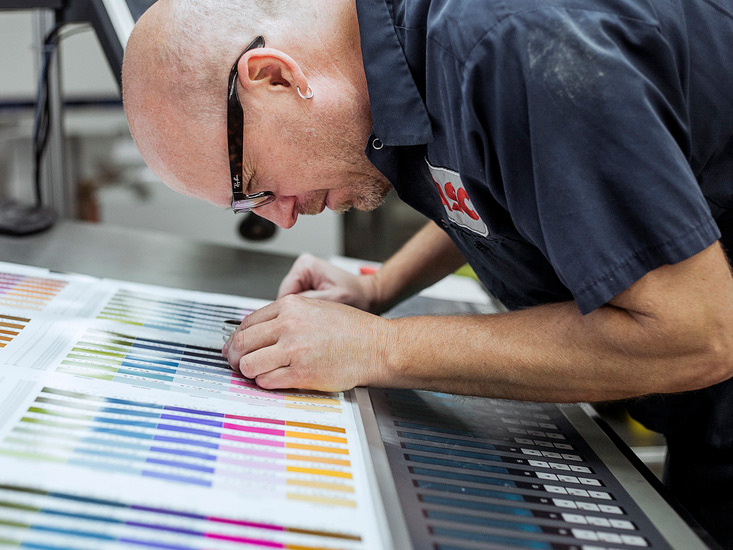
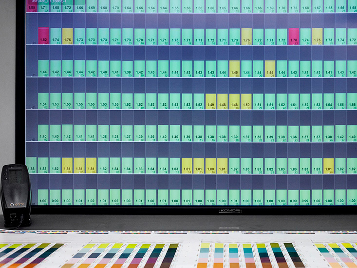
A wonderful post on AIGA’s website collected a series of photographs from Pantone’s latest color book. Each picture was taken & provided by James Chororos who’s a very talented photographer.
This new color guide is tentatively named the Extended Gamut. It’s meant to be a quicker way of matching colors and mixing colors to achieve any desired result. From the words of AIGA:
Pantone has been hard at work on a new guide for designers and printers. It’s an expansion of the company’s spot-color palette, offering a printed representation you can compare side-by-side with an existing product, making it faster, easier, and cheaper for designers to communicate their desired colors.
These photos were embraced enthusiastically by Pantone VP Ron Potesky. He says “Designers love getting into the guts of Pantone, so when we were making this guide we assumed they’d be excited to see behind the scenes.”
It’s fair to say Ron is more right than he can imagine. So without further ado here are a couple nice snapshots from the collection. If you want to see all the photos please visit AIGA’s post.
The post A Peek at Pantone’s Newest Color Guide appeared first on webdesignledger