The average person spends 60 seconds searching a website before giving up if they don’t find the information they need. If you think about it, that’s really not much time for web traffic to find and comprehend potentially complicated and detailed information on a site before choosing to look elsewhere.
Every year, web traffic grows more fickle and impatient, but people using the internet aren’t stupid. If visitors are leaving a website, the cause is very likely poor web design and an understanding that similar content can be found a few clicks away. So good web design is the solution right? Right.
Web design has a big influence on internet presence , affecting things like how traffic interacts with a website (bounce- and conversion-rates) to how effective the site is in the context of SEO and branding. While content is obviously crucial to any site, the aesthetic presentation of that content is equally important. To get a feel for good web design and visually arresting content, here are 20 of the most beautiful websites in 2015.
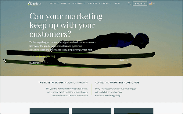
1 . Kenshoo has crafted a gorgeous website that first pulls the site visitor in with rotating hero images and an effective call to action. Then, Kenshoo keeps web traffic on their site by providing information in a clean and simple tile format on several pages throughout the site. With tons of microinteractions and easy navigation, Kenshoo’s website is hard to beat.
2
.
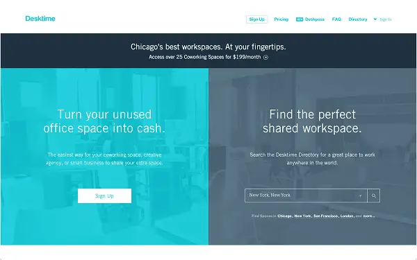
Desktime
effectively uses the splitscreen to appeal to their two different customer bases. With a scrolling landing page, Desktime manages to present all of the necessary information to site visitors without making them click anything. The site employs a coordinated color scheme, microinteractions, simple graphics, and the generous use of whitespace to help visitors digest content with minimal effort.
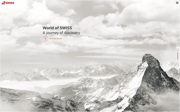
3 . Who knew an airplane line could have such an engaging website? SWISS airlines has made a gorgeous site in which scrolling creates an animation of taking off over the alps, and as the animation flows through the clouds, different articles and content emerge.
4
. Speaking of interactive,
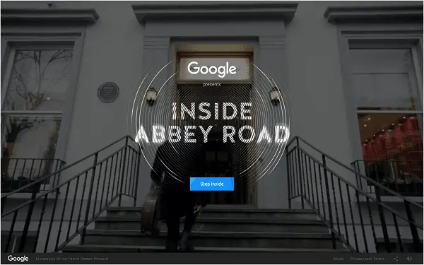
Inside Abbey Road
is an immersive experience presented by Google. The site uses multimedia brilliantly as web traffic enters the famous studio from the outside and can then interact with the studio itself, from mixing songs to watching an orchestral performance and exploring the space of the studio itself. Inside Abbey Road may not be selling anything, but it’s an engaging experience for visitors and a fun time (trust me, I spent 30 minutes playing around on the site while writing this section alone).
5
. On the other end of the spectrum,
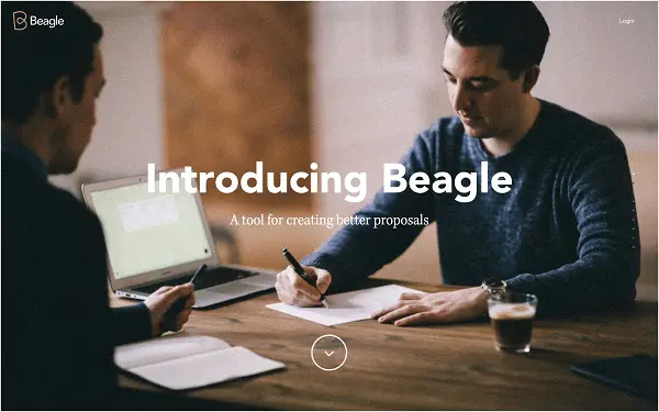
Beagle
provides minimal content on its site, but the content is supported by flawlessly executed animations triggered by scrolling. With a sign up and minimal links at the bottom, Beagle is an excellent example of one page web design.
6
.
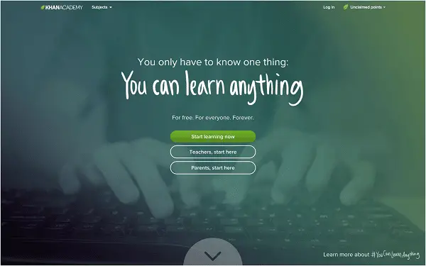
Khan Academy
boldly uses its green color scheme and utilizes empty space to convey small bites of content with statistics and animation. Khan Academy’s subjects and courses are simply organized, and for the amount of content they have, it’s impressive how easy it is to find what you’re looking for.
7
.
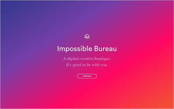
Impossible Bureau
uses the latest trends, such as microinteractions and parallax scrolling, to great effect because the site uses these design elements, particularly parallax scrolling, more consciously than most. With its striking 4-columned landing page, site visitors can easily access the site’s content, which is also presented beautifully in scrolling pages.
8
. Sometimes simple is best. Sometimes minimal is better.
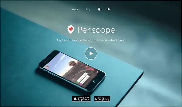
Periscope
has both down to a science on their site, which is not much more than a landing page. The landing page itself is composed of an iPhone looping a clip from Periscope’s app on a blue background. With an second optional video that opens up, Periscope tells site visitors everything they need to know with a spare use of actual text.
9
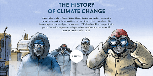
. Storytelling is trending this year, and few do it better than
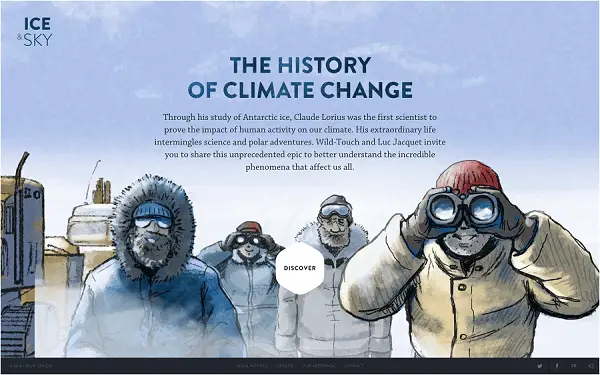
Ice and Sky’s educational program
. The site tells the story of climate change through a multimedia experience, including gorgeous illustrations, video, sound, and animations.
10
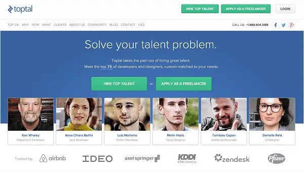
. The website of
Toptal Designers
is beautiful in part because of how it handles complexity. The site connects its network of freelancers with clients, and their talents span the full range of design (including
UI designers
, who might help you get on this list in the future). With so many specialties, Toptal’s site has found a simple way to present such a large network and explain why they are good at what they do with in-house graphics, beautiful tiles for its clients and freelancers, and stylized resumes. Information has never looked so good.
11 . Litmus creates a business around making its clients’ emails beautiful, and boy does it have a beautiful website as well. Subtle animations, microinteractions, a playful variety of colors, Material Design , and scrolling? Litmus combines a lot of this year’s web design trends into a fluid whole that is as easy to navigate as it is pleasing to look at.

12
.
Mikiya Kobayashi
designs furniture, products, and decor for interior design. His site, which showcases his work, is gorgeous. The site is entirely white with black text, and his works are showcased in tiles. The tiles are a clean presentation of his designs, and their colors pop against the stark white of the background.

13
.
ETQ
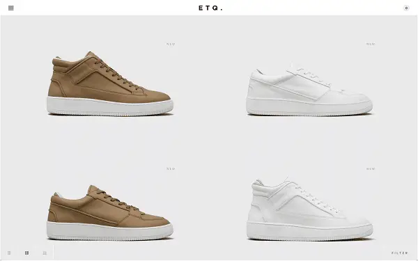
also takes note of the effectiveness of a white background. A shoe designer based out of Amsterdam, ETQ showcases its product with minimal frills, and each shoe is shown on a white background without even a label (until the cursor moves over the shoe). With such a spare design, ETQ’s shoes are given the space to shine.
14
. The
JOHO’s
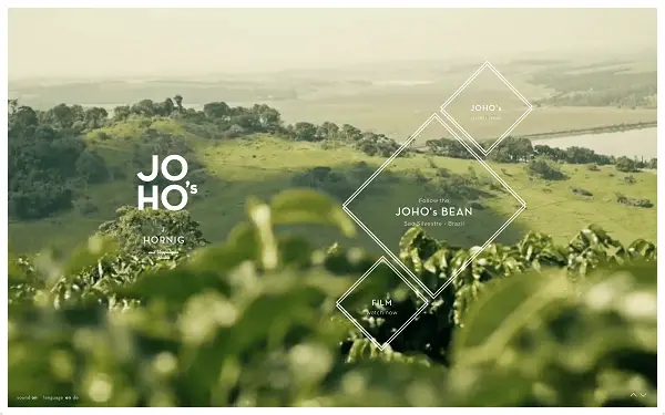
website is yet another effective storytelling medium. The site traces how the company acquires its coffee beans in a multimedia experience with video, photography, graphics, and sound. The site is based around scrolling rather than links to different pages, so navigation isn’t its strong point. But the story is so compelling, who minds?
15
. Social media analytics company
Unmetric
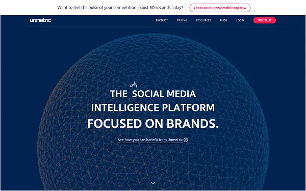
has a site simple in its execution and beautiful for it. Utilizing subtle animations and charts and graphics, Unmetric presents complicated information in a format both clear and aesthetically appealing. As a cherry on top, Unmetric is easy to navigate, minimizing the frustration in a site visitor’s experience.
16
. Online portfolio
Format
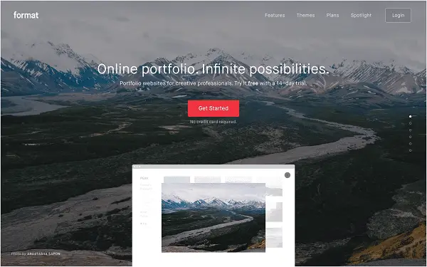
naturally has gorgeous photography on its website, including a stunning hero image. With scrolling animations, clear navigation menus, and tiles, Format has created a satisfying user experience while pitching its product to site visitors.
17
.
Slack
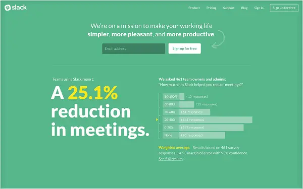
utilizes a minimalist aesthetic to showcase their product’s results on their landing page. Showing 4 charts of statistics from actual clients, Slack makes a compelling argument for why businesses should use their product with a simple layout. The rest of the site gives information on the product itself in a clean format, rounding out their site with the details potential users would want to know.
18
. With a shifting background video as its landing page image,
Big Cartel
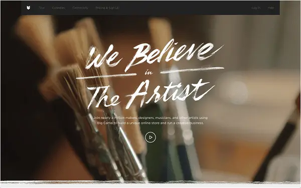
draws in traffic’s attention and then keeps it with a beautifully simple layout for the rest of the site. WIth a small menu and clear signup buttons, Big Cartel has made an effective site to draw in new business with a site as artistic as the artist community the company is targeting.
19
. Another online educational platform,
Treehouse
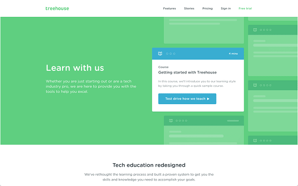
uses a simple web design to encourage site visitors to learn through them. Content is organized by subject, by project, and by track, so people can find exactly what they are looking for with ease. With a sticky menu and attractive use of color, Treehouse has created a user-friendly experience that earns a spot on this list.
20
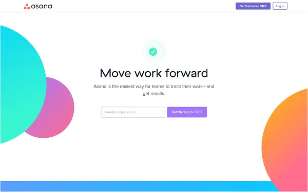
.
Asana
effectively uses color and geometric shapes to create an eye-catching web site. With plenty of blank space and scrolling, Asana presents information in a clean way through images of its product in action to better convey its use to site visitors. With subtle touches of microinteractions and animations, the site stays active enough to engage visitors without overwhelming them.
