
CSS3 has brought many changes and recently includes a new document structure named Flexbox. It’s meant to replace old CSS hacks like floats for multi-column layouts, along with empowering designers to craft simpler responsive designs.
Flexbox is supported but hasn’t gained as much traction in professional work solely based on compatibility issues. But as time moves on we’re seeing more developers switch to flexbox models and rework layouts to run smoothly.
This has paved the way for new techniques and code frameworks such as Juiced CSS. This brand new open source framework is free on GitHub with plenty of support and demo code samples.
One area of improvement is the value of mobile first design. Here’s a clip from Juiced’s documentation:
Building mobile-first layouts is the most powerful feature of Juiced. If you are familiar with a 12-column grid layout, Juiced will be a breeze to get started. There are a few awesome advantages to using Juiced over other grid systems, namely Flexible boxes. Using the Flexbox spec, Juiced lets you vertically align all columns, shift uneven or extra columns, add spacing around or between columns, auto-size and grow your columns to fit available space, and order columns for each breakpoint.
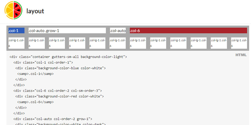
Each layout is controlled through columns which may be written as needed into layouts. So you can program any number of flexbox columns from 1-12 with varying degrees of width/height ratios.
Note that Juiced is still very young, practically in its infancy as a development framework. Also flexbox is a relatively new standard so this may not be the perfect solution for enterprise-level projects. However it’s a great way to practice flexbox and improve your frontend skills with the latest advancements in HTML/CSS code structures.
If you have time please skim through the docs to get an idea of how Juiced CSS operates.
The post Juiced – New Open Source Flexbox CSS Framework appeared first on webdesignledger