Picture this: You’re going to a big event, every person who can change your life would be there, and a lot is riding on how you present yourself. After all it’s about first impressions. So you pick out a sleek outfit, complement it with great formal shoes, dab on some perfume, wear a classy watch and feel like a million bucks.
Your confidence is at its peak. You’re at the door of the venue of the event, you pull yourself up, back straight, head held confidently high and you’re going to slay! So you step into the room and…everyone else is wearing the same outfit as you.
How does that feel? Most importantly, how does that fare for you? It screws your chances of being noticed, being approached, and striking a deal. And this is how your website feels in the room of the world wide web, when you design it based on a standard format. There’s cut-throat digital competition today, and if you’re trying to make your website big – whether in terms of making an income out of it or using it for branding – the same old design methods won’t work anymore. Unless the websites you design resonate with your clients’ audience, who by the way are regularly introduced to new and better options, these websites won’t thrive. It’s true, but something as simple as website design can cripple its potential.
Here’s how to fix that:
Want to create stunning websites for clients every single time? Want them to not just keep coming back, but referring you to more potential clients? The answer is simple, you need to be different – good different. But given how bogged down by work you are, how do you take a day off to work your creative juices and come up with something different? You don’t, we do that for you. We’ve picked some of the creative ways in which you can revolutionize a website or create an eye-popping one that would keep your clients and their customers happy. So sit back, browse through our list, stock up on these and use them abundantly whether by themselves or in conjunction to create a masterpiece every time.
1. Include the concept of Badges
The feeling of an achievement that earning a badge entails is motivation for readers to keep coming back. Take Foursquare for example, while the main objective is to encourage people to check-in frequently, the game aspect of it with badges for every level and accomplishments make this one a favorite.
Working on a content-based website? Use badges for different levels of interactions to nudge them to level up.
Or is at an e-commerce website? Use badges for customers who cross a certain purchase amount. Make this extra sweet by giving them some privilege discounts and offers.
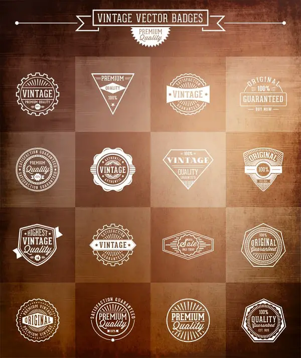
Badges are also great in announcing information. Want to tell your customers your products are authentic or notify them of an upcoming sale? Badges are an attention-grabbing, concise and appealing way of conveying important information. Here’s an example of a set of vintage-styled badges that would add extra oomph to your work.
2. Pay attention to the Font
We’ve cringed at the choice of font and font color for certain backdrops. You don’t need to be an interior designer to know it won’t work.
And perhaps it’s the risk of doing something wrong that keeps designers from experimenting at all. In the end, you’re left with boring fonts that don’t keep your readers’ attention.
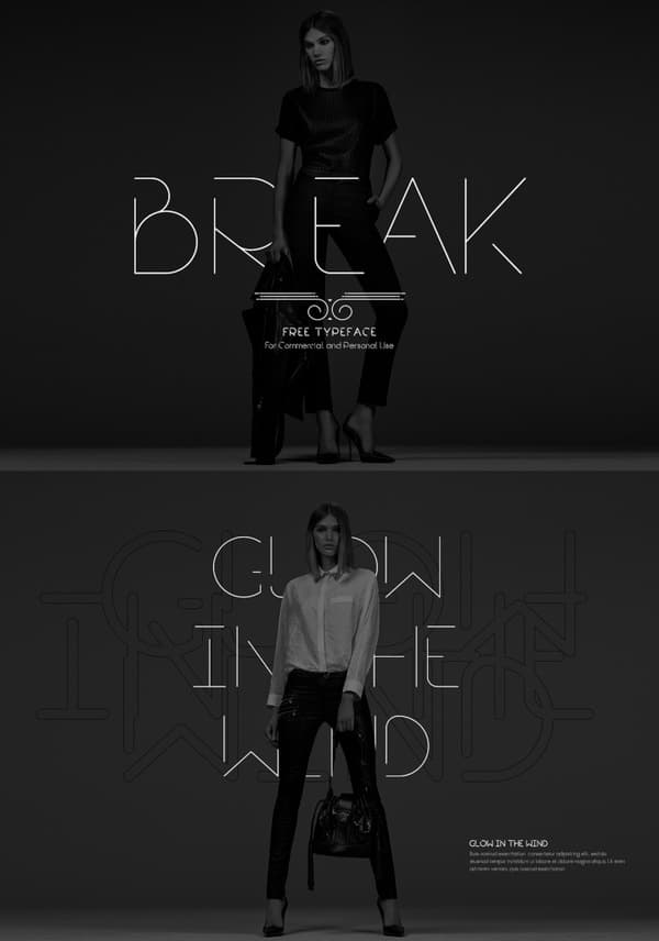
Just switching up something as mundane as your font could dramatically change your final look. Some fonts complement the culture of the website well. For instance, if yours is a fashion-based one or one that caters to youth predominantly, the Break font would be a great pick.
3. Social Share buttons
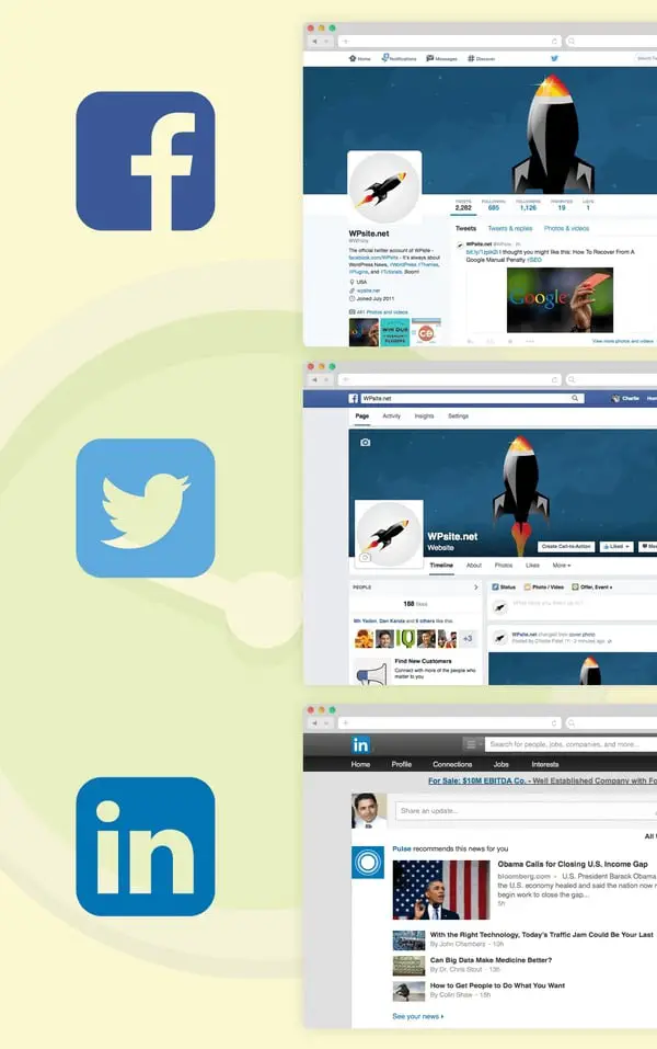
This by the way has more to do with the functionality part. Social media buttons are indispensable for websites today – even if it’s not strictly a content-centric website, if they are serious about getting and retaining readership.
Most social media icons are very basic, but for you to get an upper hand as a designer, you need to offer something more. What we suggest is a content share plugin, this doesn’t just give you the option to like or simply share a post, but also write descriptions and automates essential sharing requirements. As an example, you can check out this social share plugin that’s currently up for a 61% discount.
4. Pay attention to what others don’t like on the Login Page
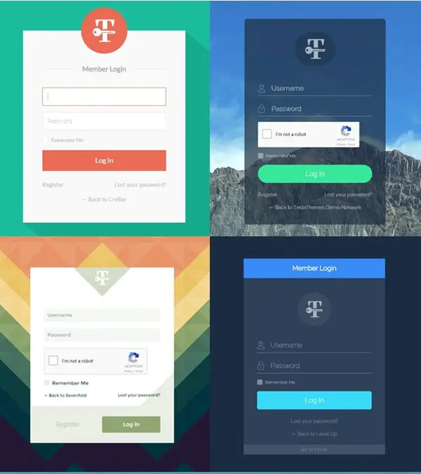
You won’t see a lot of websites scurrying to design a creative login page, and yet this is one of the most visited and crucial pages on your site.
A custom login page gives a personalized feel for both your brand and your customers. A little quirk never hurt anybody too. Get creative with this, do something out-of-the-box. Or if that would take too much time, let this login page plugin help. Even webmasters with no coding knowledge would be able to create a stunning login page themselves.
5. Play with sliders
We would have advised you to ‘include a slider’ to make your website stand out if it was 2007. Now every website is doing that. But…
But what they are not doing is taking it to the next level.
Sliders are important, they make sure your readers don’t miss out on important information like your portfolio samples or your best products. But they’ve become too commonplace.
Play around with sliders, use visual effects or write testimonials in creative fonts. Or use something like the Ken Burns effect in sliders, the panning and zooming technique will grab attention and drag it to where you want it.
Use exceptional quality images
Images are again another must on websites, and some websites even have these as a backdrop. Or if you attempt to use something like the Parallax effect, then you would have tons of images on your page.
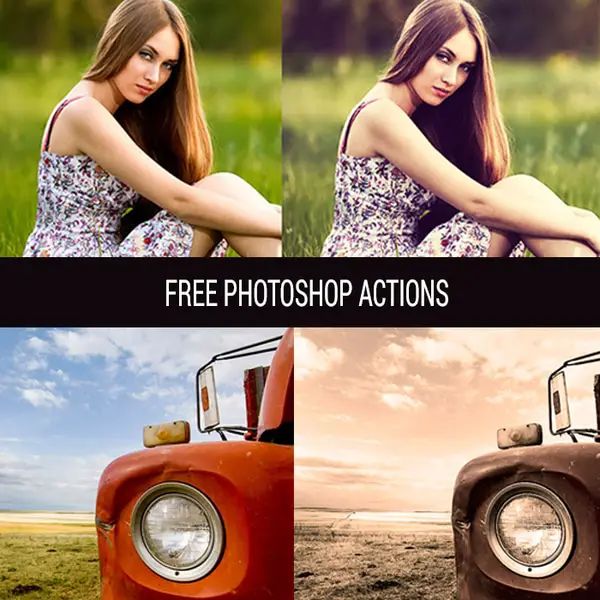
The idea isn’t to just get something from stock photos, 90% of your competitors would do just that. Instead use high quality alluring images that hikes up the visual appeal of the site. An easy way to do that is through Photoshop.
Not a Photoshop pro or don’t have the time to edit every image on Photoshop? Just use Photoshop Actions, these are created by Photoshop gurus and are a recording of a series of steps that when applied, will instantly take your pictures to a new level. Here’s an example of some free Photoshop effects actions which you can use.
Build curiosity or keep visitors in the loop with a Countdown Timer
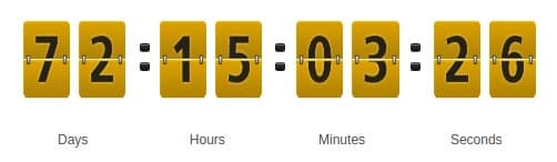
Planning to launch a sale in a fortnight or pulling your site down for some quick revamping? Make sure to keep the readers aware of the same with a Countdown timer.
This isn’t just informative but also builds curiosity, and is a great way to create the scarcity scare by pronouncing a sale to close in a specified time and counting down to it. This is an excellent sales move.
Here’s an example of a Countdown Timer plugin with different skin color choices.
Glam your website with a portfolio and double chances of getting hired
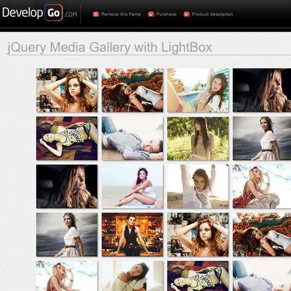
Have you even chanced upon a photographer’s Instagram page and spent a good ten minutes on it, thinking it is amazing at and liking their pictures? That’s the power of portfolio, it gives center stage to your work, harnesses its potential as a good design element, and gives a glimpse of your capabilities to your prospective clients.
As a designer, this is something you should apply on your own website too. This grid gallery portfolio is a favorite with the creatively-inclined.
Don’t underestimate the power of a good ribbon design
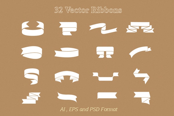
Thought these only spelled birthday greetings? Think again. Ribbons instantly perk up the look of a website, plus they’re functional in their prowess to direct attention to where you need it to be.
From headers, titles, notes, to even including in logos and page marks, ribbons might look nondescript but can quickly spruce up a page.
‘Icon’ even tell you how important this often-overlooked element is
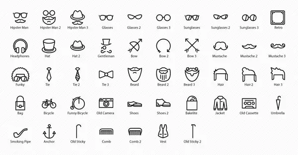
Designing is mostly about communication. You want to communicate a certain feel, a certain look, a certain idea and icon set do it pithily.
But they’re mostly used for social media sharing options, when there’s so much more you can do with them. Include icons in textual content to clear up space, as a CTA button, in presentation and more.
Use animation effects

These delight even the sternest of your readers. Cutesy baby bats flying all over the page? Awesome! Rain falling in the backdrop, perfect!
Animation effects need not be exquisite or elaborate, something as simple as a snow effect is enough to show your Christmas side even if you retail boulders for construction.
Speaking of which, here’s an example of the snow effect.
Make your website look 3D styled without any 3D style
You’ve heard of the Parallax effect, it’s become for every designer what the word ‘bae’ has become for every teenager. Parallax effect has a 3D feel by making the foreground image load faster than the one in the background resulting in a 3D look.
This is half the work and double the result, or more like zero work and double the result if you want to get a pre-done-up theme with the Parall a x effect.
Borrow from pro photographers

Ken Burns is a known name in the photography and cinematography world. The Ken Burns effect where the camera pans and zooms into a still image is a great photo editing technique that almost all pro photographers resort to.
Good news for designers, this is also ruling the designing world at the moment and is a quick and easy way to change boring static images in sliders and on the main page.
Choose an Accordion gallery
Need to showcase tons of pictures but not sure if prospects would browse through them all? A good way to both include multiple pictures and ensure visibility to each is by opting for an Accordion gallery, which is a fun and functional way to bring them in the limelight.
But you also have the option of manual scrolling, so choose one that befits your website requirements. Here’s an example of a great Accordion gallery plugin.
We loved putting this list together for you, and we hope you’re now a little better equipped to make your websites be the star of their niche!
The post 14 Ideas to Make Your Websites Stand Out appeared first on Line25.