Illustration and animation – nowadays it is a common and wide-spread combination. While five years ago websites with hand-drawn surroundings and doodles looked exclusive and offbeat, currently that won’t make much impression. In the era of cutting-edge HTML5-powered techniques, WebGL experiments and fully interactive experiences, static cartoon-inspired interfaces are no longer considered to be a jaw-dropping solution. Although they still have charm, they need a boost to stand this intense competition.
The ‘helping hand’ came from dynamic effects. Creative folk leverage small animation patterns, tiny effects, subtle motion, scroll activated animations and other dynamic means to recharge and revive details of composition as well as inject life into the idea. With our collection, we have tried to cover various spheres where this approach has been successfully adopted. We have included personal portfolios, promo pages, non-profit projects, storytelling websites, seasonal projects and others.
The Tuck Effect
The Tuck Effect is a striking website that traces the history of the tuck. It looks friendly and engaging due to its original and creative design. It is brought to life with the help of sketchy illustrations, hand-drawn graphics, marvelous characters, and of course, a subtle motion that plays a significant role in producing a distinct general impression.

Project Schoolkrant
Project Schoolkrant utilizes a series of small doodle-like illustrations to enrich one of the sections. They look bright, inventive and welcoming. Each item is set into motion by tiny dynamic effects.

Linemotion
Linemotion is a full-service agency that has a top-notch website. Delicate illustrated background charged with several dynamic features such as drifting clouds or a moving Ferris wheel works as an excellent base for the content and ghost buttons. The sophisticated atmosphere establishes trustworthy relationships as well as exudes an image of reliability and warmth. Everything lives in harmony.

Retro Rugby
Retro Rugby has a marvelous and entertaining official website that loudly presents the game. The whole design is based on a non-static pictorial scene that perfectly echoes with an app interface.

Keep Portland Weird
This website adopts a fresh take on a cartoon style that is improved with the help of high-end techniques. There is a splendid storytelling experience that is achieved through vibrant digital drawings and some accompanying effects.

Hound Studio
Hound Studio is an agency that specializes in animation and production. So it is predictable that the official website includes lots of illustrations, sketchy icons, and of course, dynamic effects. Just take a look at the ‘process’ section. It is a masterpiece that skillfully balances copy, graphics and subtle motion.

Creative Cruise
Creative Cruise gently guides you through the project populated with excellent highly detailed illustrations. Everything is made on one theme, even the typeface and sidebar navigation.

FrankenSim
FrankenSim is a matchless fully interactive website, the aesthetics of which was inspired by the 1990s. The interface breaks out from famous types of layout, offering a unique and unforgettable experience.

Dream Car Collection
Dream Car Collection is a promo website that is filled with fascinating children drawings. Each one is skillfully brought to life. As a result, the project has an inviting nature and feels fun and approachable.

Soch Technologies
Soch Technologies has a website with a clean, fresh and imaginative front page design. The dynamic background portrays the agency’s sphere of expertise as well as demonstrates its creativity and potential. Although the illustrations are merely schematic, it is enough to make a good impression.

Lobster Kitchen
The website of Lobster Kitchen catches the mood and reflects the atmosphere inherent to the restaurant. Marine motifs that are skillfully reproduced by the seascape illustration and numerous dynamic elements envelop online visitors and kindly invite them to explore the website more closely.

Resanova
Resanova’s website is driven by a parallax effect. The latter is used not only to unobtrusively walk users through all sections but also to swing several elements of each composition into action. Using scroll activated animations is an efficient way to create a pleasant and visually-appealing storytelling experience.

Gerber Ramonage
Gerber Ramonage has a cutting-edge personal portfolio that owes its beauty to flat illustrations. As usual, here you will find a cartoon-style scene that is composed of static and dynamic details. The tiny funny character will accompany you throughout the whole adventure.

Snowflake City
Snowflake city matches the mood of the festive season with ease. The fully illustrated environment that depicts a snow-covered town is brought to life with the help of subtle motion and other interactive features. Although the winter scene is sufficient to convey the spirit of Christmas, accompanying animations inject into the project a sheer magic.

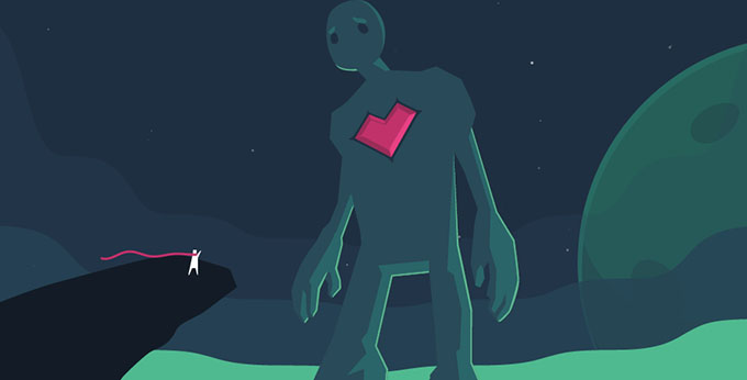
50m Space
This website is a carefully crafted variation on a cosmic theme that at first may look a bit sloppy. The page is populated with non-static and interactive features that add motion and dynamics inherent to the brand.

Keep Britain Tidy
Keep Britain Tidy is aimed to raise awareness about pollution. The team utilizes bright, friendly illustrations and small supporting animations to transform a boring survey into an engaging storytelling experience. As a consequence, the project is both informative and entertaining.

A Love Like Pi
The original and carefully illustrated design of the homepage is what brings quirkiness to the project. Although the imaginative background is capable of drawing attention just by itself, several moving, flying and vibrating elements breathe life into the concept and strengthen the impact.

Postbox
Postbox website’s beauty lies in rich and intuitive interactions and a lavish background that graphically portrays a cityscape. All together, they contribute to the visual identity of the company and make its primary service more prominent and understandable.

Cevko
Cevko leverages an active background to address the reason more effectively. Clouds that float in the sky, a leaping exclamation mark and an amusing character put an interesting twist to the idea. What’s more, the scene adapts to the time of day, including an alternative night version.

Digicots
Digicots offers visitors to get acquainted with its services in an original way. They offer online visitors to dive into a cosmic odyssey that is skillfully visualized through illustrations spiced up by subtle motion.

Conclusion
Illustration and animation work perfectly well together. They reinforce and nicely complement each other, enhance the project and make it more sophisticated and advanced. As practice shows, you do not need to utilize complex solutions; tiny, lightweight effects are sufficient to add a desirable twist to the project and impress online visitors.
The post Illustrated and Animated Best Practice in Web Design appeared first on onextrapixel