
This guide deals with mobile application design and its goal is to provide clients with information on mobile design, and help them recognize a top notch mobile designer. It touches on multiple aspects of mobile application development, some or all of which will be relevant to the specific context in which you are looking to hire.
Before we proceed to define what makes a top-notch designer, we need to be aware of the definition.
Mobile application designers focus on native mobile apps and work closely with UX and UI designers to apply their design to mobile interfaces.
Every mobile application designer should be aware of the difference between these three platforms.
The Challenge
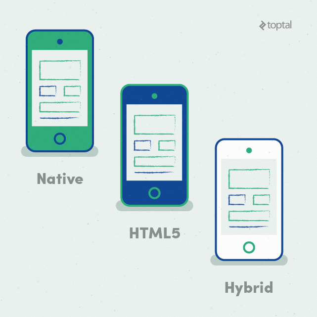
Native apps live on the device and they are accessed through icons on the device home screen. Native apps are usually installed through an application store (such as Google Play or Apple’s App Store). They are specifically developed for one platform, and can take full advantage of all the device features; they can use the camera, the GPS, various sensors like the accelerometer, compass, and so on. They can also incorporate gestures (either standard operating system gestures or new, app-defined gestures). Also, it’s worth noting that native apps can use the device’s notification system, access local information like the contacts list, and they can work offline.
Responsive web applications are not real applications; they are really websites that, in many ways, look and feel like native applications, but are not implemented as such. They are run by a browser and typically written in HTML5. Users first access them as they would access any web page: They navigate to a special URL and then have the option of “installing” them on their home screen by creating a bookmark to that page. Web apps became popular when HTML5 went mainstream and people realized that they could obtain native-like functionality in the browser.
Today, as more and more sites use HTML5, the distinction between web apps and regular web pages is blurring. For instance, there are no visible browser buttons or bars, although the site runs in Safari (when accessed from an iPhone). Users swipe horizontally to move on to new sections of the app. And, thanks to browser caching, it’s even possible to read the newspaper offline.
HTML5 vs. Native Apps vs. Hybrid Apps
A lot of features are available in HTML5. It possible to access some sensors, implement the tap-to-call feature, and even other functions, such as the device’s camera API. However, few web apps and websites take advantage of these possibilities.
There are, however, native features that remain inaccessible (at least for now) in the browser:
- The notification system, running in the background
- Sensor input such as accelerometer information (other than detecting landscape or portrait orientations)
- Complex gestures
Of course, one can argue that many apps (native or otherwise) do not take advantage of those extra features, anyhow. But if you really need those native features, you’ll have to create a native app, or at least a hybrid app.
Native mobile apps provide fast performance and a high degree of reliability. It’s important to note that most mobile video games are native applications. We all know that video games are among the most popular mobile applications, and many of them need to utilise the hardware in the most efficient way in order to ensure smooth gameplay and a good user experience.
Hybrid apps are part native apps, part web apps. Because of that, many people incorrectly call them “web apps.” Like native apps, they live in an app store and can take advantage of the many device features available. Like web apps, they rely on HTML being rendered in a browser, with the understanding that the browser is embedded within the app. Often, companies build hybrid apps as wrappers for an existing web page; in that way, they hope to get a presence in the app store without spending resources on app development. Hybrid apps are also popular because they allow cross-platform development and thus significantly reduce development costs: The same HTML code components can be reused on different mobile operating systems.
Tools such as PhoneGap and Sencha Touch allow people to design and code across platforms, using the power of HTML. Doing justice to many of these topics would warrant posts of their own. Nonetheless, this guide is intended to provide, at least, a meaningful overview of key issues and topics relating to mobile application design. Furthermore, every good mobile application designer should be aware of all the terms used in this article.
It’s not unusual for a client to demand native apps rather than responsive web applications. In order to provide a different and unique user-experience on each device, many clients will require a native application.
Q: Native, Web App, or Hybrid: Which Should You Choose?
To summarize, native apps, hybrid apps, or web apps cater to the needs of the mobile user. There is no best solution; each has its strengths and weaknesses. The choice depends on each client’s unique needs.
Q: When designing a new application, what are the most important questions you need to know?
- What is your app’s main goal?
- What are the most important sections in your app? How many are there?
- What kind of actions should be available to the user throughout the app?
- Who is your direct and indirect competition, if it exists?
- Which features and functions do you want to include in your app?
With the answers, the designer should be able to start searching for the best design pattern for the new application. Maybe the best question to ask when starting a new design would be: “If you came home angry and stressed out, looking to buy a cinema ticket, how you would like to application to work?”
The same question can be adjusted to any real-life situation and mobile app. If the application design works when the user is frustrated, then the application is probably well designed.
Q: What do you need to consider when designing for iOS, Android or any mobile platform?
When people are about to use something, they have already expectations (we call them mental models). For example, most users will buy a certain smartphone because they like the design principles behind its operating system, the appearance, or how the device works. So, the most important thing to consider when designing for iOS, or other mobile platform, is to consider vendor guidelines. While developers need to stick to vendor guidelines, the basic logic behind each application should be identical, regardless of vendor.
Designers should not try to reinvent the wheel by implementing some unexpected elements within the application. In order to provide an extraordinary experience, designers should experiment with improved user flow and interaction design. In the application industry, this is a standard; Apple does it, Google does it, and Microsoft is no exception.
Q: When designing for a diverse set of users who will engage with your products, what do you need to consider?
Along with device platform guidelines, the designer should consider accessibility guidelines for a range of users. Design for people who are young, old, power users, casual users, and those who just enjoy a quality experience. Embrace these accessibility guidelines as you would any set of design constraints. They are part of the challenge of creating amazing products.
Q: Why are application icons so important for an application and what should be considered when designing the icon?
Beautiful, compelling icons are a fundamental part of a good user experience. Far from being merely decorative, icons play an essential role in communicating with users. Focus on a unique shape; some icons have many colors or they feature gradients, but they all start with a simple shape. That allows them to be recognizable at a distance and at a glance. Icons are seen in a range of different sizes. They are large in the App store, get small on the home screen and even smaller in the notification centre and in groups. Make sure your design scales well and is clear at any size.
The designer should also test the icon on different wallpapers; while it might look great against a traditional backdrop, iOS raindrops for example, there’s no guarantee it looks great on all wallpapers. And try grouping your designs into folders to evaluate how they look.
Q: How to design an intuitive user-interface and still achieve the “Wow!” effect.
Intuitive means easy to understand or operate without explicit instruction. The designer should always use different visual treatment for icons that are “tappable” and icons that are used as indicators and are “non-tappable.” Once a coherent system for distinguishing tappable from non-tappable icons is in place, the designer needs to follow it throughout the mobile app. In order to achieve the “WOW effect,” the designer should play around with unique shapes (for example custom made icons), animations, and then present them in a whole new way.
For example, the paper plane is now widely recognized as the “Send” icon. When it was first introduced, it was probably a little bit confusing for a user. “What is this paper plane? What does it have to do with email?” In many applications, the “Save” icon is an image of the extinct floppy disk. A life buoy icon could be used, instead. Once users understand or discover the meaning of a new UI element, it becomes “intuitive” the next time.
Three Components of the “Wow!” Factor
If the designer is limited by brand guidelines, the “Wow!” effect can be achieved in other areas.
Let’s imagine that we have a beautiful and expensive pen. But if it doesn’t write well, we will probably abandon it and go for an ordinary pen that suits our purpose. Fancy, eye-catching design cannot always help an ineffective product, so we must always think about designing an experience that pleasantly surprises the user by helping him to achieve the intended task faster and efficiently.
It is important to note that “Wow!” factors depend on the concept from the UX/visual designer being well executed by the programmer.
Q: Should we use gestures in our mobile application and how will they affect User Experience?
With the integration of gyroscopes and motion sensors, smart devices are able to detect movement. With this, the interaction between the user and the device extends beyond the click and tap, bringing real-life gestures to the screen.
Users are intuitive about gestures. When asked how to delete an item, users tried to move the item out of the screen regardless of age, sex and gender. Enhancing the user experience with fewer taps or scrolling allows applications to become more interactive.
Q: How will 3D Touch technology from Apple change the interface?
Force Touch technology does not enable truly new gestures, it is simply an extension of gestures we are already familiar with. It will help designers and developers to add a Z-axis in order to provide more depth of information on a top layer without touching or overcomplicating the Information Architecture underneath.
Q: How many fonts are recommended and what is the best practice with typography while designing mobile applications?
Reducing the number of fonts on a screen can reveal the power of typography. Instead of using different typefaces and leveraging different characteristics (e.g. italics, bold, semi-bold), different font sizes can better differentiate discrete areas of content. Embracing a singular typeface across an entire app drives consistency not only for branding but also across channels — e.g. app, mobile site, website — thus optimizing the mobile elements across the omnichannel experience. Also, users prefer the simplicity of having one typeface while scrolling for relevant content.
Q: What are micro-interactions and why should we use them?
Micro-interactions are small, visual enhancements (for example, an animation or a sound) occurring around a use case. These scenarios may include completing a transaction, flagging an item, or prompting a pop-up message. Such interactions are subtle, but they differentiate the product by pointing the user’s attention to the right element.
Micro-interactions may be leveraged as a signal to prompt the user while accomplishing a task (adjusting a setting, for instance), thus creating a small piece of content such as a pop-up message. Apps with well designed micro-interactions are considered easier to use, more fun, and more engaging by their users.
Final words
Before designers choose to create something, they must conduct market research in order to learn what’s out there and what they have to do to create a unique and successful design.
The biggest difference between developing a mobile application and a desktop application, or even a website, is context. This is what makes mobile apps so powerful. Each app is used for its own purpose, at a specific time and place. There are several ways to accomplish the same action for mobile, and it’s up to you, the designer, to design and choose the most effective way.
Business vector designed by Alekksall – Freepik.com