Browsing around articles that predict web design trends for this new year, vertical split screens seem set to soar in popularity. This style of web design usually presents the user with two options on the direction they wish to take on the website from the landing page, but they can also show an image on one side and have the About section or a menu, or a link or links to other important areas of the site on the other side.
However the designer uses this style, it certainly seems to be gathering speed, so we have selected some of the best examples of vertical split screen designs around at the moment for your inspiration.
Split Screen Landing Pages
Matthew Hall
Matthew Hall uses a black and white image of himself on the left side of the landing page, and the right side contains a hamburger menu button, his About section and an arrow indicating you should drag, swipe or click to continue through his vertical scrolling site.

Prevention R3 Summit
This site uses an image with a gradient transparency on the left. This side of the screen also has the hamburger menu icon. The right side is scrollable and the content is the details of the 2016 summit such as Program, Speakers, Activities, etc.

Lillehammer 2016
The Youth Olympic Games of 2016 are to be held in Lillehammer in Norway, and this is the official site for that event. The screen is not split 50/50 on this site, the smaller left side of the screen shows the date of the games and a countdown clock – this clock is supplied by Omega, and clicking on the link here will take you to their website. The left part also contains a link to the games schedule. The right part of the screen shows an image and contains a menu bar at the bottom of the page, and scrolling arrow to move across the vertically scrolling site. The large + button in the top corner shows the image caption.

Desktime App
This screen shows 2 animated backgrounds and each half of the screen has contrasting blue transparencies. The left side has a Sign Up CTA button and the right side contains a search box to help you ‘Find the perfect shared workspace’.

Dewey’s Pizza
This site has a slide show of 3 typographic promotional items on the left, and a CTA on the right to buy eGift Cards. The menu is overlaid down the middle of the page.

55
This site uses a large red block on the left size that simply has their company name and the fact they are a data agency, and the right side has only a red arrow on a gray background for you to move into the website.

Peugeot
Two slide shows running side by side greet you on this landing page. Their sub-heading on the top navigation bar is ‘Motion & Emotion’. The left side of the screen has a ‘Discover’ CTA button, being the ‘Motion’ part, and the right side has a ‘Feel’ CTA, being the ‘Emotion’ part.

Construction Papers
Here is another site that uses the left side of the screen simply to display their logo and an image. The right side is their About section and includes a link that invites you to order your copy of their digital guide.

Studio Meta
This site uses a split screen throughout, and when you land here you are viewing their portfolio of work. A navigational bar down the left side lets you move onto whichever of their projects interest you, or you can simply scroll down the page to see them all. The right side of the screen has a small description of the project, a ghost button to visit the site and another hollow button to go to their contact form.

Green XIII
This is the portfolio site of Viktor – a logo and web designer. The landing page has a nature image on the left with the designer’s logo and the right side has his About section and social media links. Scrolling down the page will take you to other sections of the site.

Carel & Piet Hein
This business project is run by the two named people, and the split screen shows images of both of them. That is the only point of the split screen used here, the navigation menu runs across the top of the page, and scrolling down brings you firstly to their About section.

R/K
This is the portfolio site of Ukranian designer Roman Kirichik. A very minimal, monochrome design, a hamburger menu icon occupies the center of the left, white side of the page and a paragraph about the designer along with a CTA button to view his works occupy the right, black side.

The Ocean Resort Residences
This site oozes luxury with its beautiful images throughout. The landing page has a split screen with 2 images, and the slide show has some full width and some split screen images. They also use the landing page as an opportunity for visitors to sign up for their newsletter.

Res.im
This small team are digital product developers. Their split screen landing page has a black block on the left with a navigation menu, a tagline and a ‘Let’s work together’ CTA. The right side shows one of their apps and a link to the Case Study.

Joris Delacroix Back In Business
This is a promotional site for this singer’s new music video. The split screen here offers you to choose the simple experience on the left, or the interactive experience on the right.

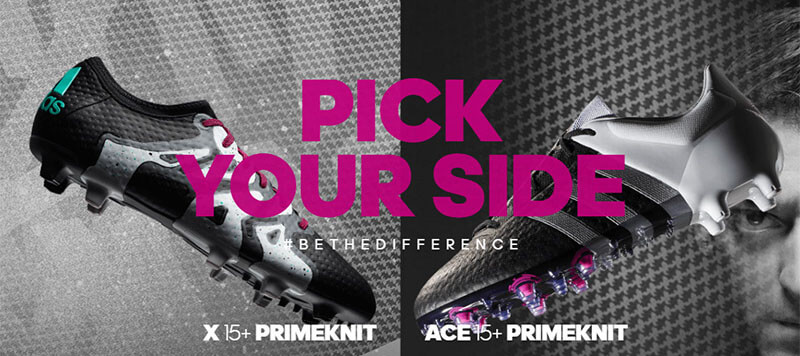
Adidas Football
This landing page offers you to ‘Pick Your Side’, and the sides are 2 of their football boot models, the X15+ Primeknit on the left, and the ACE15+ Primeknit on the right.

Madame de
This site is split all the way down the home page with a pale blue transparent block on the left side, which overlays the full screen image. The landing page has no CTAs, only the logo, the services provided and a quote, and a small (almost missable) hamburger menu icon.

Tens Sunglasses
Tens offer what they call ‘the ultimate filter’ on all of their sunglasses. The landing page shows the image of a female wearing a pair of sunglasses in a snowy situation on the right, and features their ‘Cruiser’ model on the left.

Hello Monday
Here is Hello Monday’s About statement: “Hello Monday is a Digital Creative Agency on a mission to turn the worst day of the week into the best one. We create joyful digital experiences and unique visual identities that tickle the brain, please the eyes and connect the hearts of brands to the hearts of their consumers.” They use the left side of the screen to describe the project and the right side has an image that has a touch of mouse-over animation.

Galvan Mobili
This Italian furniture supplier has their landing page split by two slightly offset images, each with a call-to-action button. The left image will take you to their Brands, and the right will take you to their Services.

Conclusion
So as you can see from the above examples, there are many and various reasons to use a split screen. For some it is simply a trendy way of presenting their site, for others it lends itself beautifully to the two main things they want to bring to visitors’ attention.