There are many markets that aim for elegance in their design, such as high-end fashion houses, perfumeries, interior designers, hotels and resorts and jewelers, to name just a few. Some miss the mark by varying degrees, but others get it totally right and their site presentation simply oozes elegance, beauty and opulence.
These are the sites we have searched for to compile this round up, the ones that have achieved amazing elegance in their design. Often the effect is achieved through the photography and/or typography used, sometimes through the layout or different-from-the-norm design. Sit back and enjoy the high-class beauty of these site designs.
Elegance in Website Design
Leen Heyne
The pastel color scheme and the minimalism of just two diamond rings featured on this landing page give it an amazing elegance and beauty.

Nicole Fashion Group
This site uses gold and black typography that perfectly complement the desaturated or black and white imagery used on the slideshow that all add to the elegance of this design.

The Refinery
This is the only site dedicated to menswear that made it into this round up. Presented in a very dark color scheme, The Refinery’s tagline is: ‘Dedicated to helping every man become a modern gentleman’ – and this statement is backed up by the elegance of the whole site.

Il Salone Milano
This Italian manufacturer of haircare products uses a slideshow on the landing page with some dreamy images and gold and white typography. A very elegant and beautiful design.

Casta Diva Interiors
This interior design company uses a photograph of a very elegant bedroom design on its landing page. The particle animation adds a further touch of elegance.

Rodeo Drive
A very famous Beverly Hills shopping center, this promotional site uses a slideshow of photographs with a transparency over them – it is the transparency that gives this site design it’s elegance and dream-like effect.

Soo Kee Jewellery
This is not the landing page of this site, although the landing page slideshow does include some very elegant imagery. This page of the site is promoting their jewellery collections, and it totally elegant with a card design all presented in a minimal style.

Givency – Dahlia Divin
This site tells a complete story, and uses scrolling on a path and scrolling animations as you scroll up through the pages. The soft, peach background and particle animation, along with the imagery used keep this site elegant from beginning to end.

Lablosh
This is the site of a waxing clinic – not a particularly elegant process, however, the slideshow on their landing page uses some very elegant photography in black and white.

Lin Shiao Tung
This jewelry company uses a dark image of a twig with gold seeping out of it – somehow this effect brings an amazing elegance to the image.

Solage Calistoga
This site is promoting the Napa Valley resort of Solage Calistoga. The landing page has a slideshow showing images of things you can do at different points of the day. This night time image of taking a glass of wine really makes you want to indulge in the elegance and opulance they seem to offer.

The Revy
The Revy is a tourist attraction at Australia’s Sydney Harbour. The whole site is presented in a very elegant style, using dreamy images, black and white photographs and an old map.

Paul Hewitt – Signature Line
This site is promoting a watch – and the image here shows the side of it – the winder. The gold on black imagery oozes elegance.

St. Moritz
St. Moritz is a very high-class Swiss skiing resort, and this site design is obviously aimed at the people who can afford to visit. The use of transparency over the landing page image adds to the elegance of the photograph.

Guilhermina Shoes
This site uses pastel colors, a pair of legs trying on shoes – all of the same, neutral color. The color scheme and minimalism give this site not only an unusual presentation for a product site, but also an elegant appearance.

5 Style
An unusual landing page image for a fashion site, but it certainly adds elegance, which continues throughout the site, with a card-based layout with plenty of whitespace, large black outline icons and an overall minimal feel.

Dior Prestige
This site pretty much bleeds elegance – the white rose and gold typography on a black background give kudos to their Prestige beauty range of products – if it needed any more than the name Dior behind it!

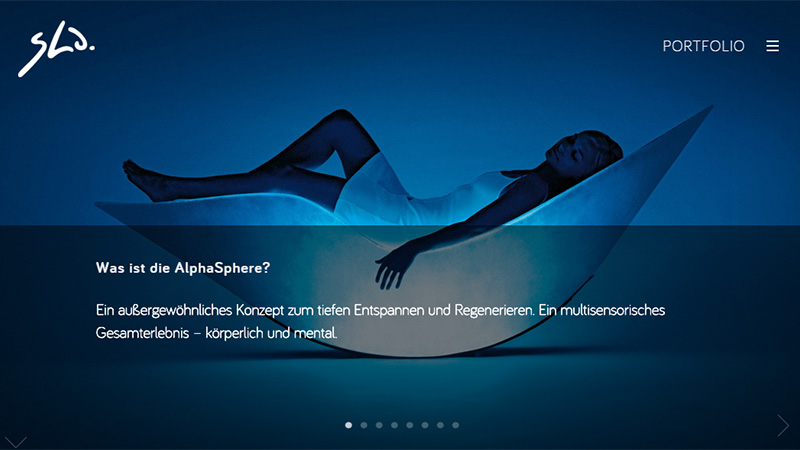
Sha
This company produce mainly modern seating, and all the images have their own elegance – but this blue-toned image is the most elegant of them all.

Imperial Homes
This luxury property developer uses transparencies of different densities over their images which, as we have seen a few times before in this round up, give a real elegant feel to the imagery.

Failsworth 1903
This company manufactures hats – as you can see from the site, very high-end hats. Here they use blurring to create an elegant feel to their images.

Conclusion
It is obvious from the featured sites that transparency and blurring go a long way to improving photographs when aiming for elegance, and either rich color schemes or pastel ones can make a great deal of difference.
The post Sheer Elegance – Beauty and Opulence in Web Design appeared first on onextrapixel